Testing and Improving Quantity Conversion in Pro Sales Tools
I led a usability study to understand how sales associates interpreted system-driven quantity and unit-of-measure changes in Home Depot’s QuoteCenter platform. By clarifying breakdowns between UI, data, and business rules, the work helped make complex sales behavior more understandable and lower-risk.
Why I’m sharing this project
This project was an early example of me working on system integrity problems — where UI, data, and business rules collide.
Situation
Home Depot wanted to grow its marketshare with professional contractors.
QuoteCenter gave sales associates access to a massive catalog of stock and special order products, enabling them to quote and sell materials for an entire job in one place.

Earlier work to structure complex product options had gone well, but we hit a deeper challenge.
It started in 2014 as we expanded into more special order categories and products were specified in bundles, cases, rolls, packs, and coverage-based units like “squares”.
In 2016, we attempted to simplify this by introducing automatic quantity conversions — associates entered what the customer wanted, and the system converted it into purchasable units.
Shortly after launch, we began to see confusion. Associates struggled to interpret quantity changes, vendors priced the same products differently based on packaging, and internal teams began relying on workarounds. What initially looked like a usability issue revealed something more fundamental: unit of measure had become a structural problem spanning UI, data, and business rules.
This case study documents a senior-level usability study I led to make that hidden complexity visible, reduce risk, and help the team reason more clearly about how quantity and units should behave in real-world pro sales workflows.
Problem
Between 2014 and 2017, unit of measure had become a structural friction point across multiple systems that was negatively affecting transaction speed, associate confidence, customer confidence, order accuracy, return rates, and resulting in rejected or delayed POs.
Even small delays or misunderstandings at this step compound quickly in Pro sales, where quotes can include dozens of line items and errors cascade into returns, rework, and lost trust.
Team
I worked with a wide variety of stakeholders and collaborators across departments.
Ben
UX Designer
Stephen
Sr. Developer
Chris
UX Designer
Jisu
UX Designer
Peggy
Product Manager
Mike
Product Manager
Jeff
Merchandising Manager
Gregg
Lead Business Analyst
John
Supplier Operations Manager
My role was to de-risk a high-impact system change by:
- Leading a usability study
- Aligning PM around scope and risk
- Translating evidence into decisions the team could act on
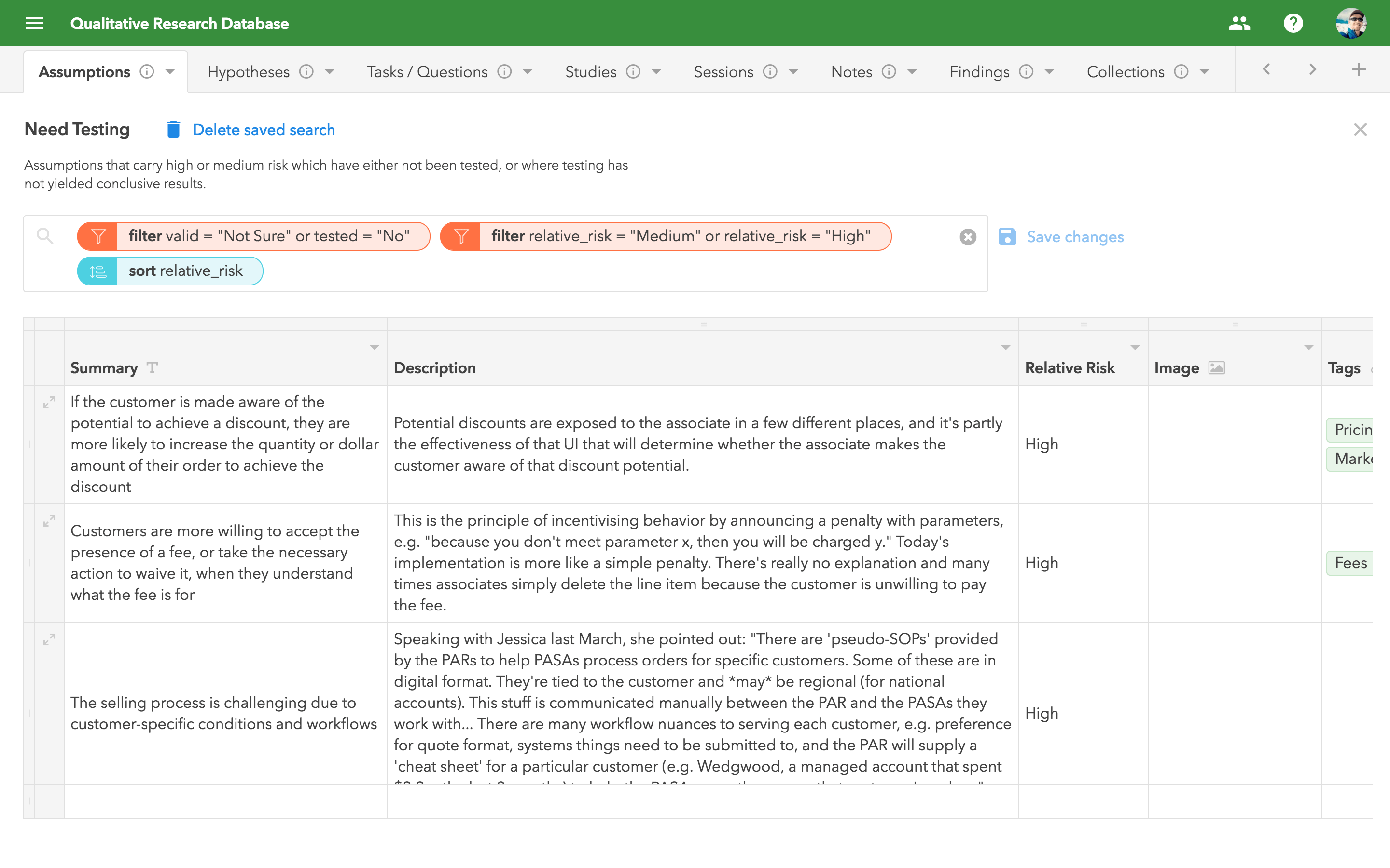
Along the way, I also refined and stress-tested a custom research repository I had built.
Constraints
I had to balance a number of real-world constraints, such as:
- Vendors priced their products in different units (e.g. bundle, pack, case, roll, etc.) and sometimes included special rules like minimum quantities, increments (e.g. you must purchase 2, 4, 6, etc.), and tiered pricing
- Unit conversion factors had to be sourced from both internal and external systems
- QuoteCenter had long supported “draft items” which meant users could add a product with a generic (unit-less) quantity — that made the initial data entry easier, but it delayed the inevitable step of determining the actual, purchasable quantity
Objective
This study was one way I helped the team build confidence — internally and with leadership — that QuoteCenter could handle real-world Pro complexity without breaking trust.
(Structuring Complex Product Options was another project aimed at this goal.)
Approach
I’ve come to recognize the balancing act between gathering enough evidence to inform decisions and spending too much time gathering data, thus slowing delivery. See “Reflection” for more on this.
I combed through my running list of assumptions to find those with the highest relevance and risk, and converted them into structured, testable hypotheses.
Knowing we’d need both quantitative and qualitative data, I designed the study to begin with a standard task-based usability test, and end with a brief interview.
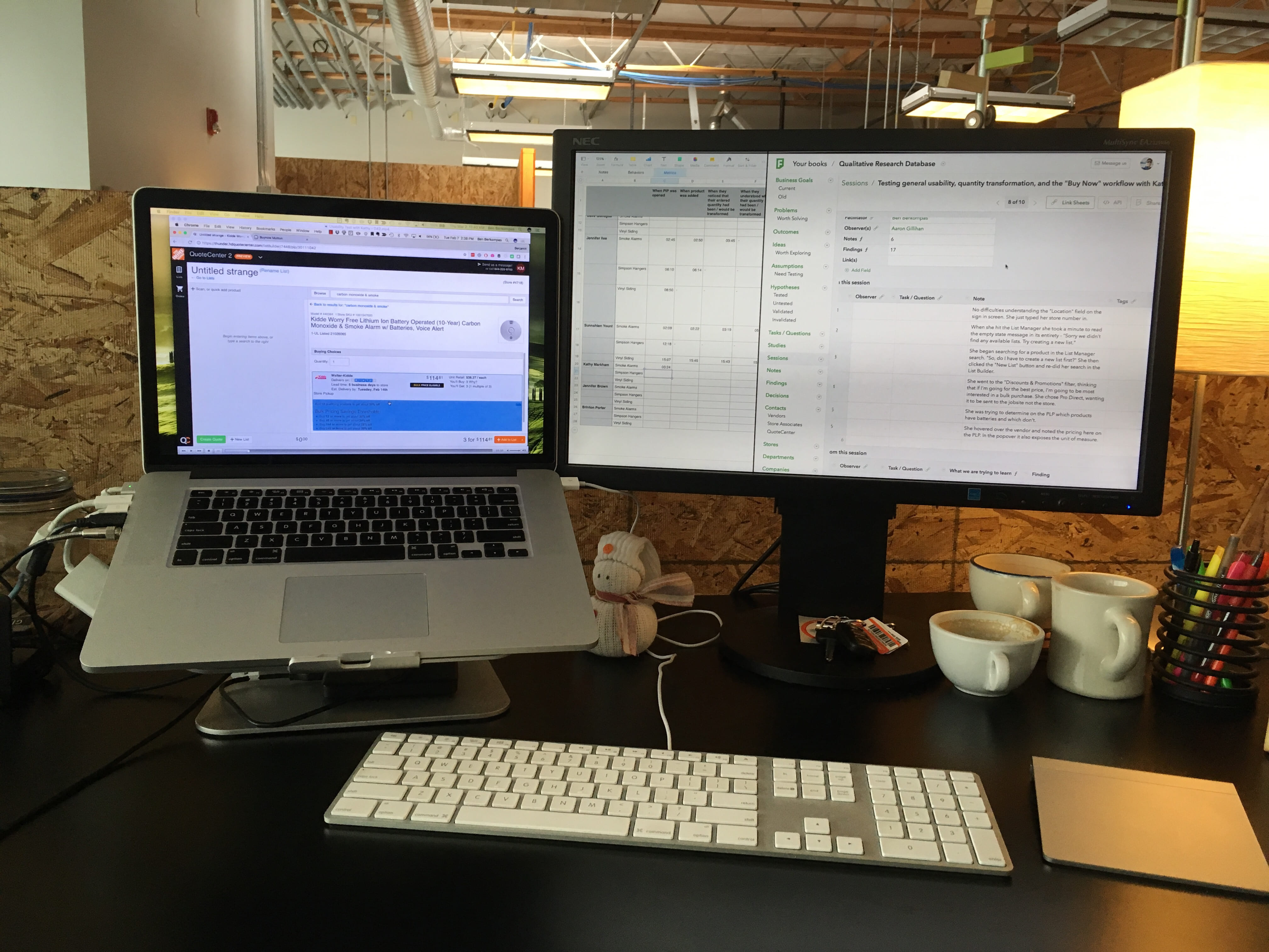
During each session I recorded the screen and audio, and took detailed notes by hand; Chris was an observer for most of these sessions, and also took notes, which was really valuable.
Afterward, I reviewed the recordings and aggregated hundreds of notes, direct quotes, and timestamp data.
This allowed me to pinpoint time-on-task and dig into the why behind that data.
Finally, I synthesized everything into a focused report and partnered with PM to translate my specific design recommendations into our backlog.
Key decisions
Narrowed scope of analysis
I started with 13 hypotheses and naively chose to design the study around all of them.
After 2 full days and 9 meaty sessions, I had hundreds of data-points but no clear target to guide my analysis.
Conventional wisdom says you should limit yourself to 1-2 big questions per study. I was beginning to understand why!
With some help from my manager, I realized that there were two questions that mattered most:
- Do users notice when the quantity changes?
- Do they understand what to do about it?
This allowed me to focus my analysis on decision-critical behavior instead of drowning in data.
Measured severity, not just presence, of usability issues
Usability issues can have a domino effect. Sometimes they’re more contained, but other times they set off a series of unfortunate events that snowballs into something more significant.
I wanted to find out if that was happening here.
After all, transaction speed and associate confidence were important levers in pro sales. Everyone wants the order to be correct, but nobody wants to babysit the software or second-guess everything it does.
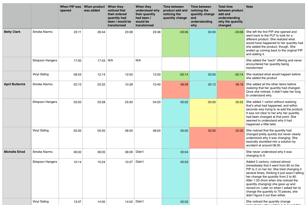
I chose to capture timestamp data in order to measure severity, which allowed PMs and engineering to reason about impact, not just system logic.
First I captured timestamps for specific actions, then ran simple calculations to determine the time elapsed between them
It’s one thing to say “6 out of 9 participants noticed when the quantity changed from what they originally entered…” It’s another to say “for the 6 people who noticed the quantity change, it took them 44 seconds on average to notice…”
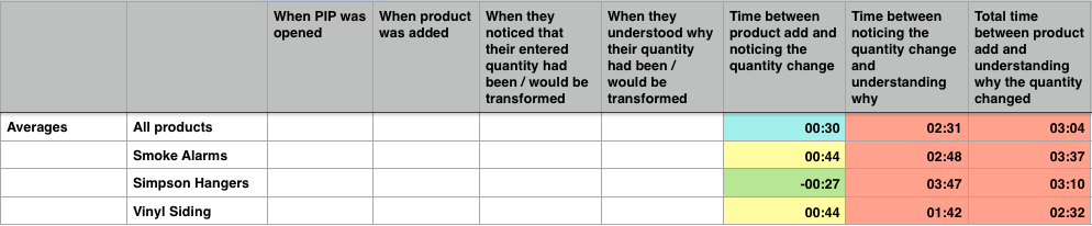
Then I aggregated the timestamp data and calculated a per-product average
Test with realistic data
I worked with some of our internal teams to identify scenarios with high unit of measure variance to make sure we’d be studying things with real-world complexity.
We used the following products in testing:
- Kidde smoke alarms
- Simpson hangers
- Vinyl siding
The usability issues were widespread, but these showcased the precise problems we needed to address and gave me talking points that stakeholders could easily relate to.
Results
Our results indicated that a satisfactory* number of participants were able to notice and rationalize the quantity change (90% of the time they noticed, 79% of the time they were able to rationalize), however the time it took for them to do so was unacceptable.
*At the time, I treated 79% comprehension as “good enough.” Looking back, I see that as a benchmark — not a target.
If 79 out of 100 associates were able to understand the system’s behavior, that meant that 21 could not understand it. What if one of those 21 associates was serving an important new account and made an error that resulted in a rejected PO?
In my recommendations, I addressed 20 specific ways we could improve the design so that users would notice and rationalize the quantity change within acceptable time limits.
Solution
The changes I recommended made the system’s behavior legible and explicit, which reduced the need for workarounds and second-guessing.
Before
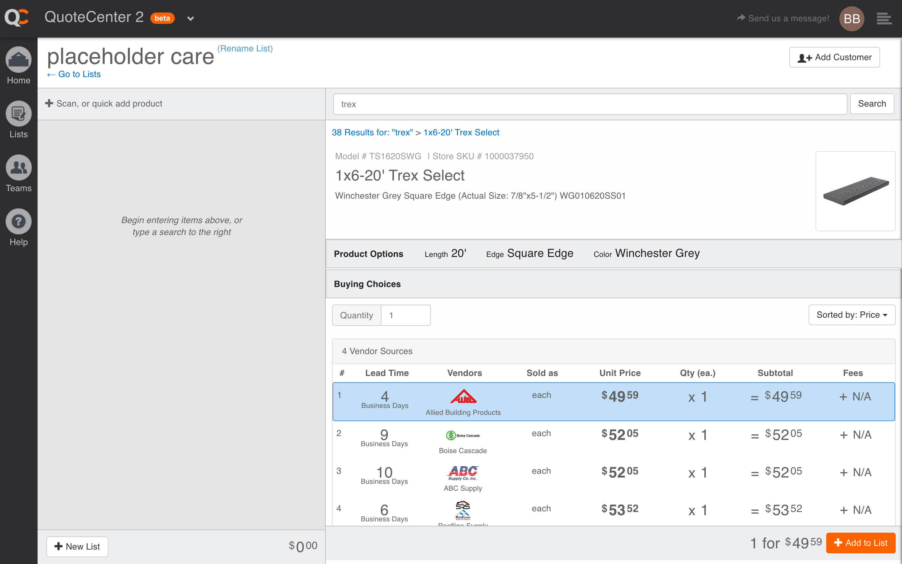
It’s hard to see the quantity conversion process with a quantity of “1”, but in reality it was very subtle.
Make “what you’ll get” unambiguous
Instead of expecting associates to infer anything or do math in their heads, I suggested we show how many purchasable units the customer will receive post-conversion (bulbs, cartons, bundles, etc.).
This “unit of measure” metadata had been missing, so we added it to line items, vendor offerings, search results, etc.
We also added a unit of measure selector (“each,” “pack of 5,” “case of 30”) to contextualize the original quantity they entered.
Provide a clear summary of your selection
Because “1” could mean many things, we added a bit of metadata to the bottom toolbar explaining:
- what was entered
- how the system adjusted it
- what the customer will actually receive
Expose some of the underlying logic
It’s not always wise to expose system logic, but in cases like this where we needed associates to trust the system and be able explain things to customers, it made sense to let them peak backstage.
We did this through in-context conditional messaging.
After
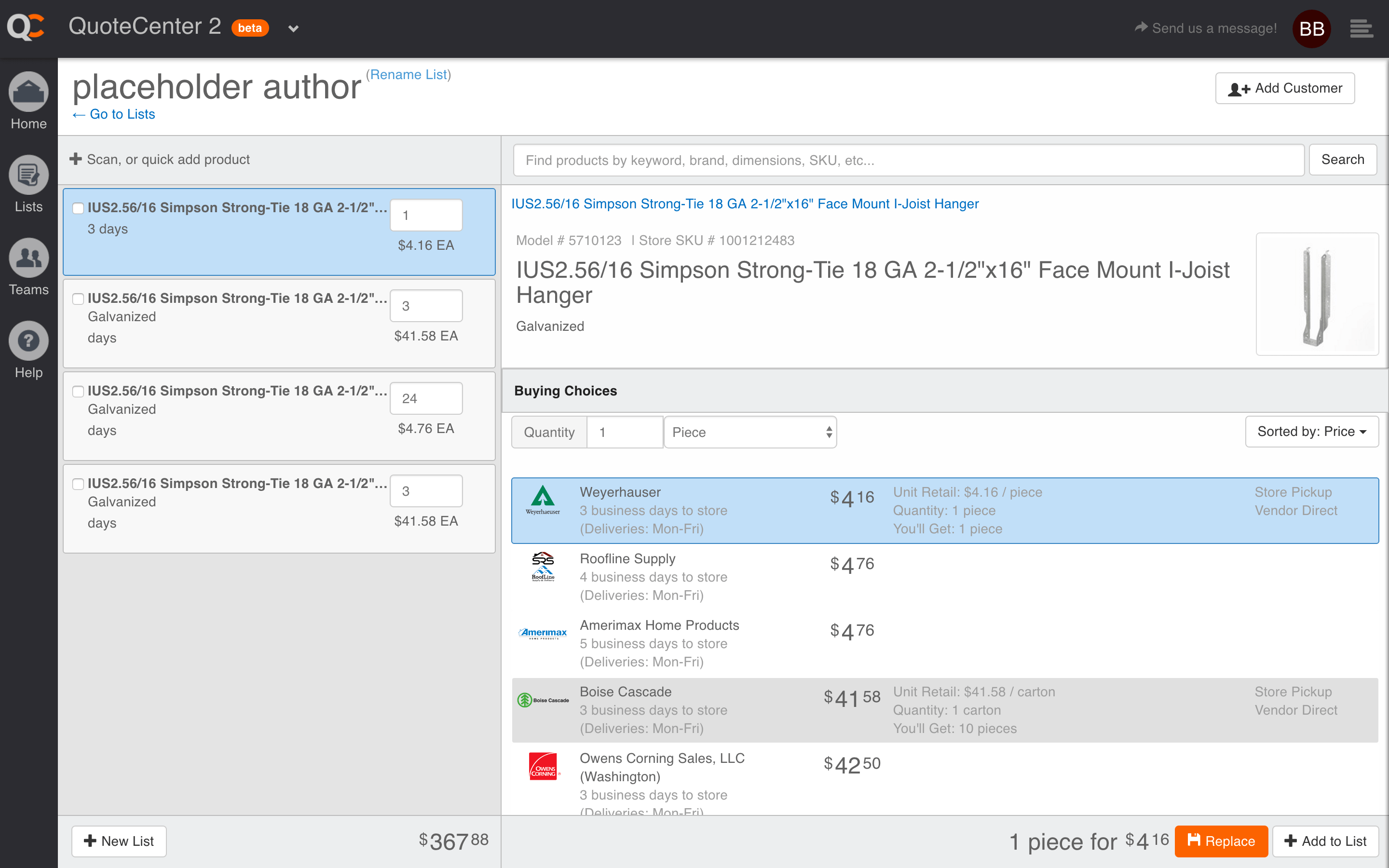
Notice how we reduced the information density in vendor offerings, spelled out how many “you’ll get” and included the unit of measure in the bottom toolbar
Outcome
For the first time, multiple teams were able to discuss UOM using the same language and evidence, rather than anecdotes and exceptions.
The study provided ample evidence to justify our unit of measure cleanup work, and a much more precise diagnosis to guide the changes.
The research repository I created helped us move toward earlier, hypothesis-driven testing for high-risk changes, and demonstrated how we could put key assumptions to the test and ultimately build confidence in high-risk decisions.
Reflection
These lessons reflect how I approach my work today:
- Clarifying system behavior early
- Focusing on high-leverage changes for complex problems
- Using evidence to align teams
Test earlier
Don’t wait until something has been released to production before conducting some kind of usability testing. After this, we began testing preliminary concepts much earlier in our design process.
Limit scope
Establish very clear and limited scope up front. We tried to tackle 13 hypotheses. In reality, we should have limited this to 2–3. Thankfully, before I did too much analysis, my manager helped me trim the scope down to just 2 questions. This was after we had already gathered an immense amount of data, though, so it would have been better to limit scope up front. These days I mostly restrict my research to a single hypothesis or question at a time.
Limit participants
Limit the test to 5 participants. I was very pleased to have so many willing participants, but it would have been better to conduct two separate studies (one to benchmark, another to re-test!) with 4–5 participants each rather than a single study with 9 participants.
Increase collaboration
Collaborate with non-design stakeholders on the test plan. Depending on the study, stakeholders often have their own questions and concerns which the research could help address. In this particular study I waited to involve our product manager until after the study was complete; he would have benefited from being involved much sooner. This also helps with post-testing communication and persuading stakeholders to buy in to the results, even when they conflict with their strongly-held beliefs.