Structuring Complex Product Options for Real-Time Sales Conversations
I redesigned the way we exposed product variants in one of Home Depot’s sales platforms. By modeling objects, attributes, and states upfront, my design supported a non-linear workflow for sales associates that helped them focus on the sale, not the system.
Why I’m sharing this project
This work is from 2016. I’m sharing it for two reasons:
- It shows my roots. The systems-oriented design practice I have today emerged from years of effort. Back then, I didn’t yet have the language or frameworks I use today, but I was already wrestling with object attributes, state logic, non-linear workflows, and conceptual clarity — things that are now commonplace in my design approach.
- It illustrates how my thinking has evolved. Looking back, I can see where my instincts were strong and where I’ve grown. I often analyze and learn from my own work; this kind of reflection strengthens my intuition and helps me get better.
Situation
Home Depot was actively trying to increase marketshare with professional contractors.
Pros are a demanding customer segment with high expectations around price transparency, speed of service, delivery options, and product availability.
The QuoteCenter platform was central to this marketshare expansion because it gave Home Depot’s sales associates access to a combined catalog of both stock and special-order products. This meant a contractor could, in theory, buy their entire project package through Home Depot.
But decking and other complex products come with attributes (e.g. color, length, edge type), nested taxonomies (brand → series → product line), and availability rules (not every attribute combination is purchasable). That complexity often caused confusion for associates, slowing down conversations and undermining trust during high-stakes sales interactions.
Pro customers don’t want to hear:
Hold on, my system won’t let me choose that
They want quick, confident responses that help them meet the needs of the project and satisfy the homeowner.
Problem
We needed to help associates translate a contractor’s request into products that were actually available, without disrupting the sales conversation.
Paradox of choice
This wasn’t simply a case of cleaning up a layout, reshuffling information on the screen, or improving a dropdown.
At its core, the problem was systemic and structural, not just visual:
- How do we expose the full set of available product options?
- How do we support free exploration and avoid dead ends?
- How do we preserve user intent even when the system’s availability rules prevent certain combinations?
- How do we keep everyone’s attention on the sale, not the system?
- How do we help associates and contractors arrive at purchasable configurations quickly and confidently?
This is a classic “paradox of choice” situation:
- Let them explore everything we have to offer
- Help them find the specific thing they actually want
Team
Ben
UX Designer
Jon
Lead Developer
Mike
Product Manager
I led the UX side of the work:
- Competitive analysis
- Interaction design
- Determining the final logic and UI
Constraints
The QuoteCenter platform already had a robust data model. We were used to handling complex products with many attributes, and had recently integrated with Home Depot’s stock inventory system.
Our main constraints were:
- Expressing the data model, representing all purchasable variants of a product
- Designing an interaction pattern that would scale across our entire catalog
Objective
At the end of the day, we were trying to win executive confidence that QuoteCenter was a scalable sales platform, not just a niche app.
Approach
Before designing, I mapped the underlying structure:
- Objects: product, variant, vendor
- Attributes: color, length, edge type, brand, series, price, etc.
- Rules: certain attribute combinations are valid, others are not
- Dependencies: product availability depends on whether a particular store carries it in stock, and whether they can obtain it from their local network of special order vendors
- Workflow: associates need to explore options in any order
- States: valid or invalid
- User intent: most recent selections signal the strongest intent and should be visually emphasized
This foreshadowed what I now do with Object-Oriented UX (OOUX): mapping objects, relationships, actions, and attributes before touching the UI.
Key decisions
Several foundational decisions shaped the final design:
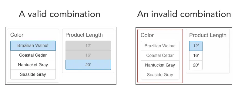
- Allow invalid selections. Handle them with clear messaging, not disabled options.
- Persist prior choices. Even if a combination is invalid, users should understand why and how to resolve it.
- Prioritize recency. The most recent selection indicates intent, so the UI should emphasize pathways forward from that point.
- Convey constraints visually. Subtle cues (e.g., diagonal line for options that would cause an invalid combo) help set expectations before committing to a choice.
- Design for conversation, not clicks. The workflow had to support natural associate–contractor interaction in real time.
These decisions were made on principle—not just preference—guided by what would best support the associate during a live sale.
Solution
The final solution applied these structural decisions to the layout, interaction patterns, and visual cues so that associates could explore freely without losing face in front of their customer.
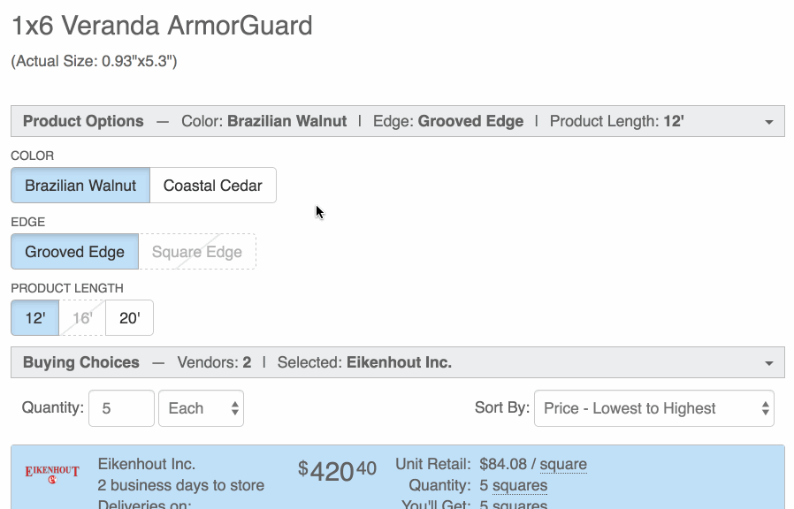
Before
The vertically-stacked layout for the product options made poor use of screen real-estate.
Products could be purchased in certain colors and lengths but not every color/length combo was available.
In the left-hand image, the 12' option looks disabled but is actually clickable. When you do click 12' (see the right-hand image), your selected color does not persist and the interface appears to be in an error state.
Layout
We needed a more condensed layout that made the best use of screen real-estate, and enabled users to take in the whole “landscape” of product options at a glance.
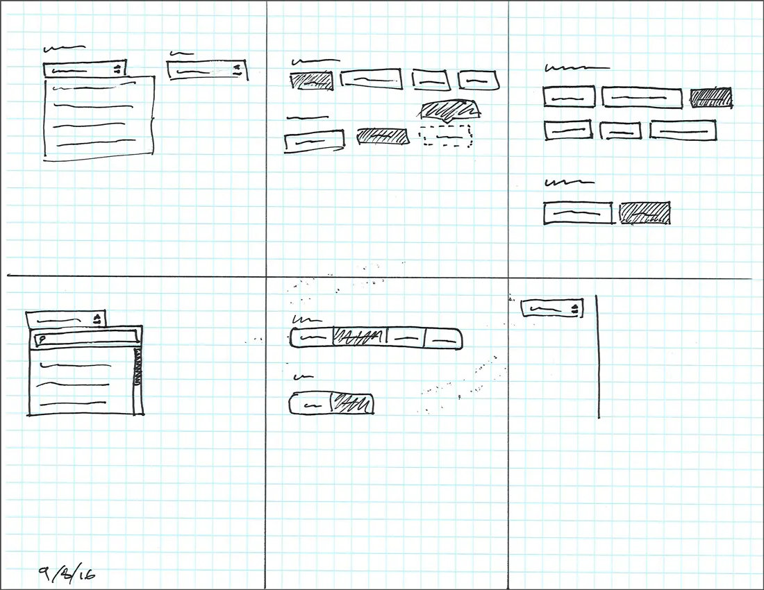
Sketching lets me fly through concepts without investing too much time.
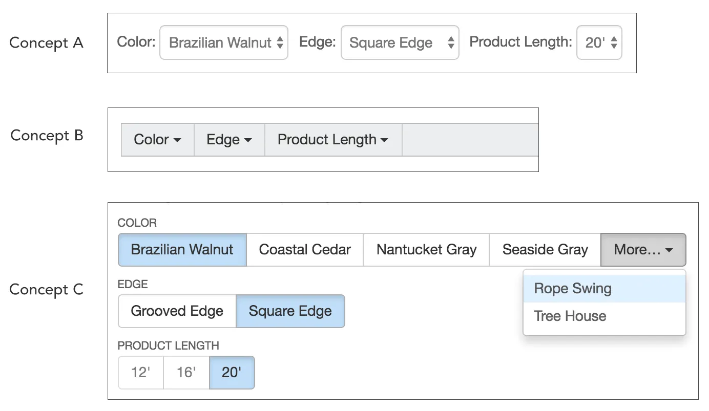
I narrowed my ideas down to 3 different concepts, weighed the pros and cons of each, and settled on concept C, seen below — a series of horizontal button groups. It not only maximized vertical real-estate, but was also well-suited for our responsive layout, allowing us to maximize horizontal real-estate by using an overflow menu. Most importantly for our users, it makes their options visible at a glance.
- Concept A did a decent job of showing the categories of options, but could only display one option within each category. Everything else was hidden behind a click.
- Concept B could only display the categories, which meant clicking was unavoidable.
- Concept C allows all categories and most of their options to be visible at a glance.
Interaction Design
Having searched and landed on a product page, associates’ next step is to inform their customer of their options, and then select a valid combination of those options.
Designing for Exploration
Associates needed an experience that would build their confidence in what was available so they could have a natural conversation with their customer.
Imagine you’re the customer in this scenario:
Customer: I need some composite deck boards for an upcoming job…
Associate: We carry those. Any specific brand?
C: I usually buy Trex.
A: Looks like there are a whole bunch of colors — Brazilian Walnut, Coastal Cedar…
C: Some kind of gray. Seaside Gray looks right. Those should be 16’ long.
A: Okay, I selected Seaside Gray but it’s not letting me click 16’…
C: Really? You don’t carry 16 footers?
A: I thought we did, but my system isn’t letting me do that length. Hold on, let me try something else…
Notice what happened. Everyone’s attention switched from the sale to the system. This is a common occurrence for our store associates.
My design helps to prevent this by first allowing an associate to select whatever the customer is asking for, and then explore what their other options are given their past selections.
There are no dead ends and no prescribed sequence. It’s a non-linear workflow.
Creating a Coded Prototype
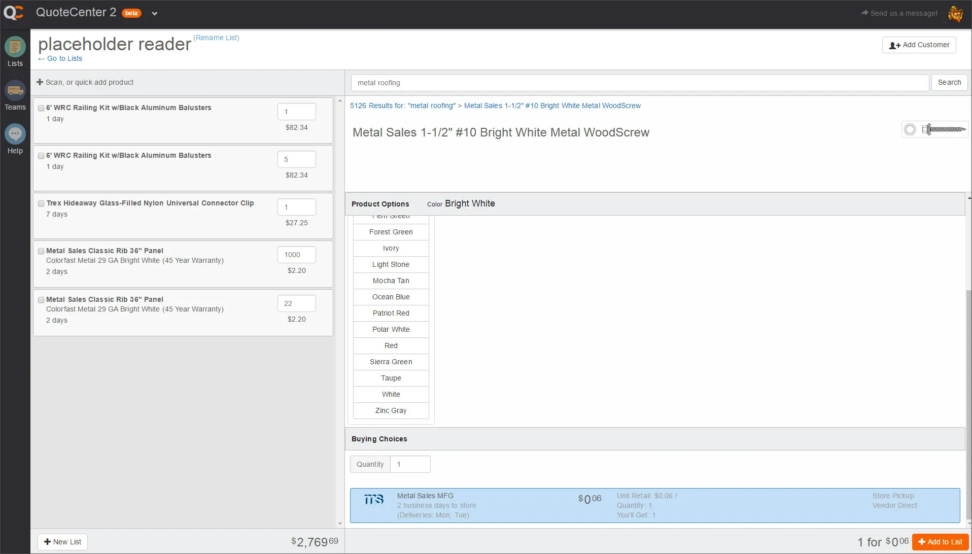
It didn’t take long for me to realize that written descriptions, sketches, and static mockups wouldn’t suffice for designing more complex interactions, so I created a coded prototype using HTML, CSS, ReactJS, and MeteorJS.
This means that I can actually experience the interactions for myself, and effectively explain them to development, product management, and the broader design group.
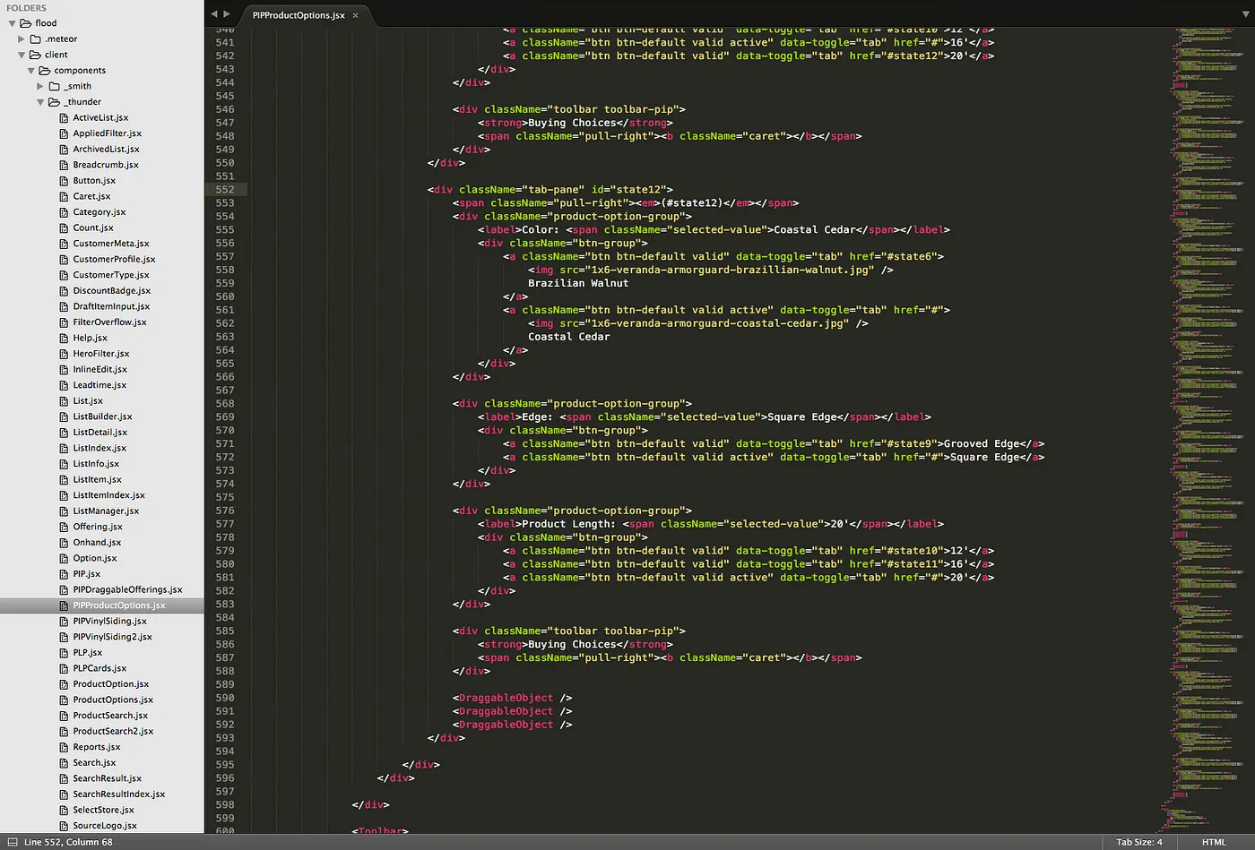
I often turn to code for interaction design projects like this. There are few other prototyping mediums that get me highly realistic results faster than code.
Designing for Confident Selection
Shortly after I settled on a non-linear, exploration-friendly workflow, a variety of questions arose:
- How should the interface handle the selection of invalid combinations?
- How should the interface convey which combinations are and aren’t available?
- Should the interface attempt to communicate the reasons why a combination is invalid, or simply that it is?
After a series of iterations, I landed on the following design.
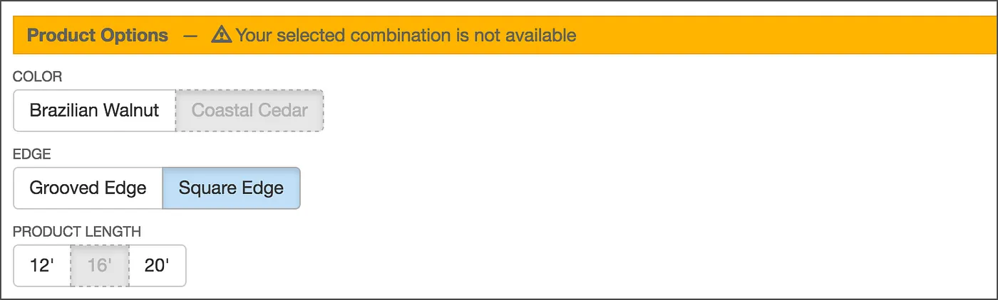
I decided we would allow users to select invalid options, and that their past selections would persist. This means they could end up in an invalid state. To explain this state, I designed a simple message for this state — “Your selected combination is not available” — because it seemed like the most natural way to let users know what was going on.
Visual Design
This interface required some thoughtful visual cues. There were four primary problems I tackled in the visual design:
- Which attributes should be shown as invalid?
- How do we acknowledge user intent when they select an attribute?
- How do we prevent it from feeling like a dead end when their selected combination is invalid?
- Where should labels like “Color,” “Length,” etc. be placed for maximum usability?
The “Glimmer of Hope”
The three concepts below show different visual approaches to the same underlying logic. In all three concepts, 16’ was selected last.
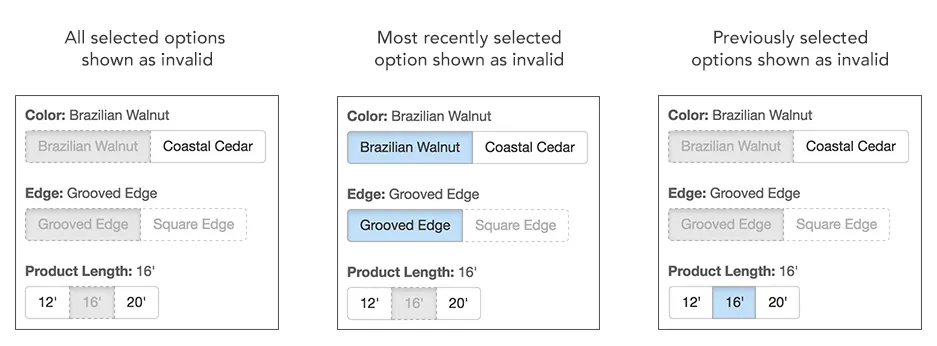
Notice how only the third concept (on the far right) makes it feel like you have a path forward. We called this our “glimmer of hope” style, because it makes you feel like the system is moving you forward with each subsequent selection, instead of making you feel like you’ve reached a dead end.
I felt like there was a relationship between recency and intent: the more recent the action, the more likely it is to indicate user intent. That being the case, the design should put more weight on recent actions than on older ones.
The system is moving you forward with each subsequent selection, instead of making you feel like you’ve reached a dead end.
Emphasizing Invalid Options
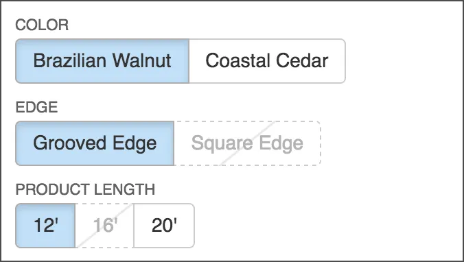
While I had already designed some simple messaging for when users are in an invalid state, I thought it would be desirable to help them steer clear of that state altogether, or at least set the expectation that if you click this option, your selected combination will be invalid.
I did this by adding a subtle diagonal line to the button’s background. This was pleasantly easy to do with CSS!
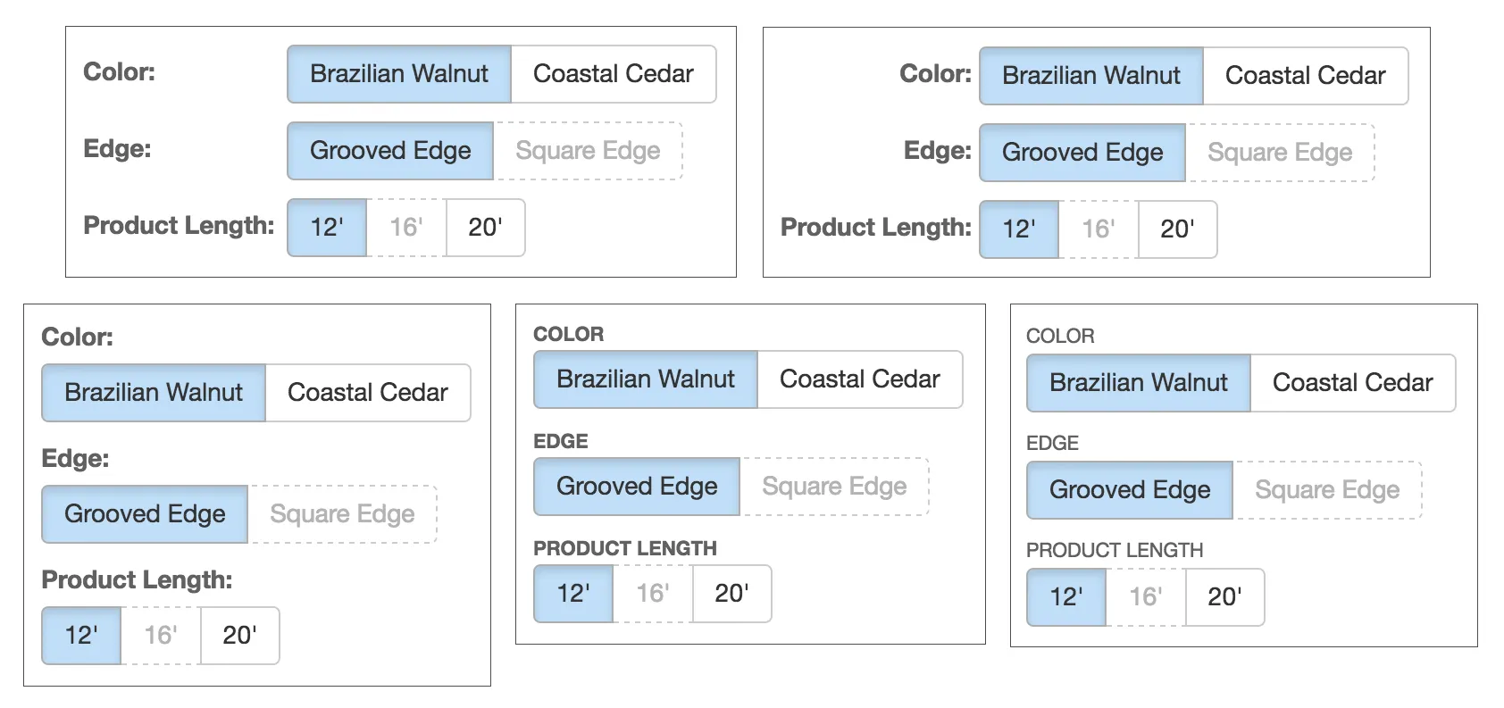
Label Placement
Finally there was the issue of where to place the labels (e.g. “Color,” “Edge,” etc.). Should they be inline with or above the button groups, aligned left or aligned right? I ended up following the recommendations in this eye-tracking study by Matteo Penzo, placing the labels above the button groups, left-aligned, small, all-caps (for readability), and non-bold.
Reflection
Looking back, this was one of the first projects where:
- I recognized the need to understand the structure of a system — objects, attributes, and states — before designing interactions.
- I realized how crucial it is to preserve user intent in complex workflows.
- I began integrating coded prototypes into my practice when interactions were too nuanced for static mocks.
- I saw clearly how UX decisions support business goals (speed, accuracy, trust, and contract value).
This project marked an early shift in my career from designing interfaces to designing systems of meaning, structure, and interaction.
It helped establish the core of the practice I use today.