Aligning Conceptual Models for Relational Accountability
As a new accountability feature expanded in scope, I focused on resolving conceptual misalignment before it surfaced as UI churn or product debt. The result was clearer decision-making and a durable foundation for execution.
Situation
Covenant Eyes has been helping people quit porn for over 25 years. The service relays activity from a person’s device to someone they’ve chosen to hold them accountable.
Historically, this all happened via emailed reports which were passive and static.
When we launched Victory — a reimagined version of our flagship accountability service — as a mobile app in 2021, in-app communication became possible. It was a more active, bi-directional channel which brought both opportunity and complexity.
“Check-ins” began as a modest upgrade of our traditional email-based reporting. As we realized the true potential, however, we set our sights on something bigger: a deep, self-reflective experience, helping people connect in a more effective, relational way.
Email reports had gone through many iterations over the past 15 years, and check-ins marked a brand new chapter.
Problem
Everyone was excited by the idea of check-ins, but as scope expanded it became clear the problem was no longer feature design — it was conceptual alignment.
The team was operating in a state of “presumed agreement.”
Courtesy of Jeff Patton & Associates (https://jpattonassociates.com/glad-we-all-agree-2/)
Team
My role was to support the design lead by diagnosing and resolving conceptual misalignment across stakeholders.
Tim
Product Designer (lead)
Ben
Product Designer
Aaron
UX Researcher
Collin
Product Manager
Sam
Director, Recovery Ed
Justin
Marketing Manager
Robert
Member Care Manager
Nicole
VP Product
John
Product Strategist
Constraints
- Stakeholders expected concrete artifacts, while the real risk lived at the conceptual level. Tim and I deliberately paired his concrete artifacts with my abstract modeling to maintain momentum without locking in faulty assumptions.
- The workshop was designed for in-person collaboration, with Tim facilitating. I needed to be an active participant but was not able to attend in person. We were able to overcome this, and it turned out better than anyone expected.
- We had timeline pressure: just 3 weeks to plan and prepare, including running a series of pre-workshop stakeholder interviews.
Objective
We needed to surface and resolve stakeholder misalignment before screens or detailed specs committed us to a direction that might lock in faulty assumptions or create product debt.
Diagnosis
The team was operating under the presumption that everyone agreed. This apparent consensus masked quite a bit of misalignment and subtly stood in the way of progress.
Key fault lines included:
- Who the experience is primarily for (hero vs. ally)
- What information a check-in should contain
- Degree and timing of hero control
- Whether check-ins would be more transactional or relational
Without resolving these issues (and others) at an early stage, the downstream UI work would become a battleground where deeper disagreements re-emerged.
Approach
1. Pre-workshop interviews
I conducted six interviews with individual leaders who’d been invited to the workshop.
These interviews were a foundational step toward alignment
Using lightweight prompts, I focused on surfacing these issues:
- Individual definitions of check-ins
- Assumptions about structure, cadence, and ownership
- Where confidence existed, and where it didn’t
While there was generally strong agreement on desired outcomes, there was weak alignment on the information structure and mechanics that would allow us to achieve those outcomes.
2. Agenda designed to foster productive conflict
Interviews suggested a number of areas where disagreement was likely, but only some of those topics would be productive at this stage.
Rather than presenting solutions, Tim and I decided to frame key areas of misalignment that were worth arguing about.
The goal wasn’t consensus, it was reaching a shared understanding of tradeoffs.
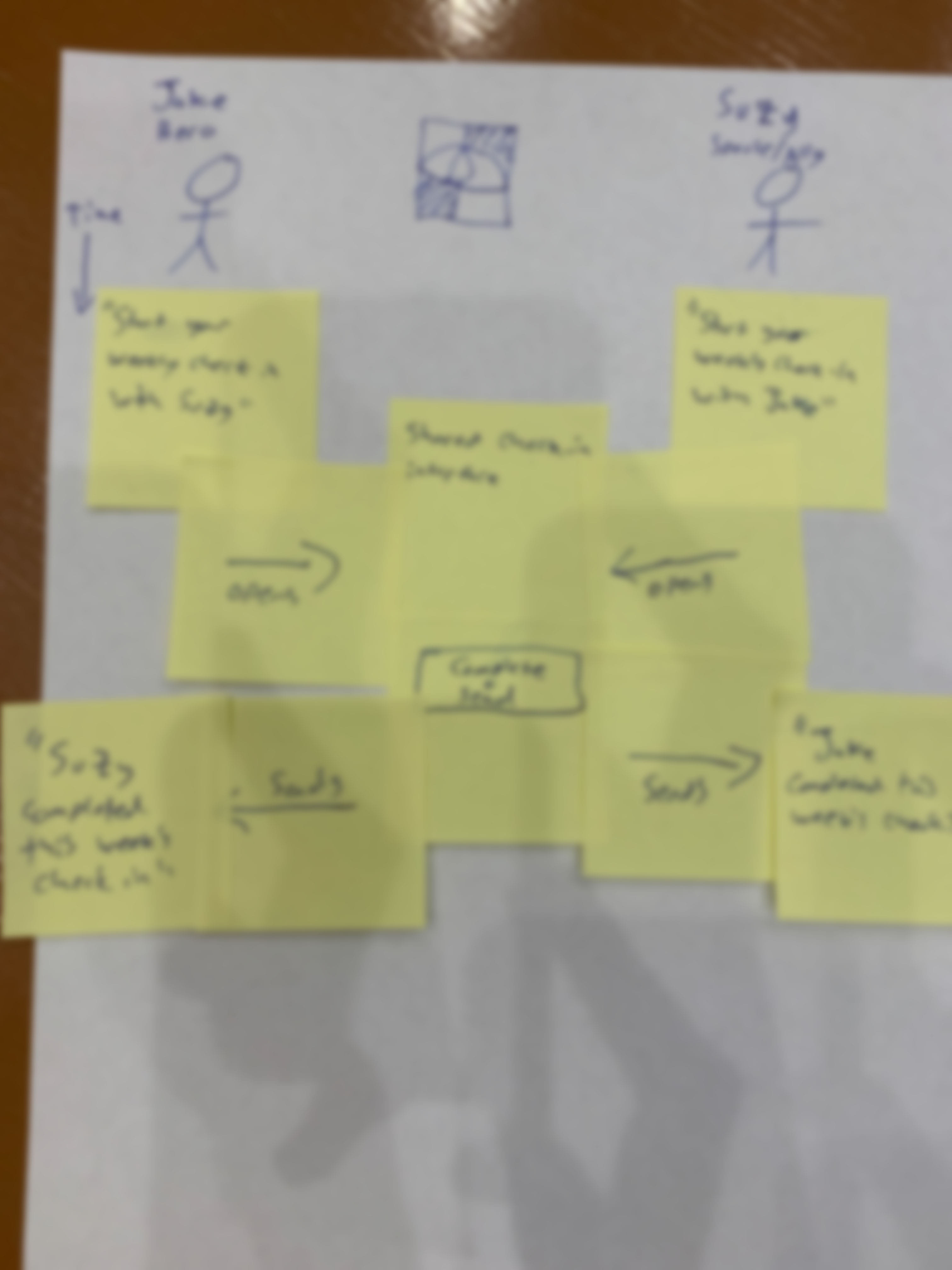
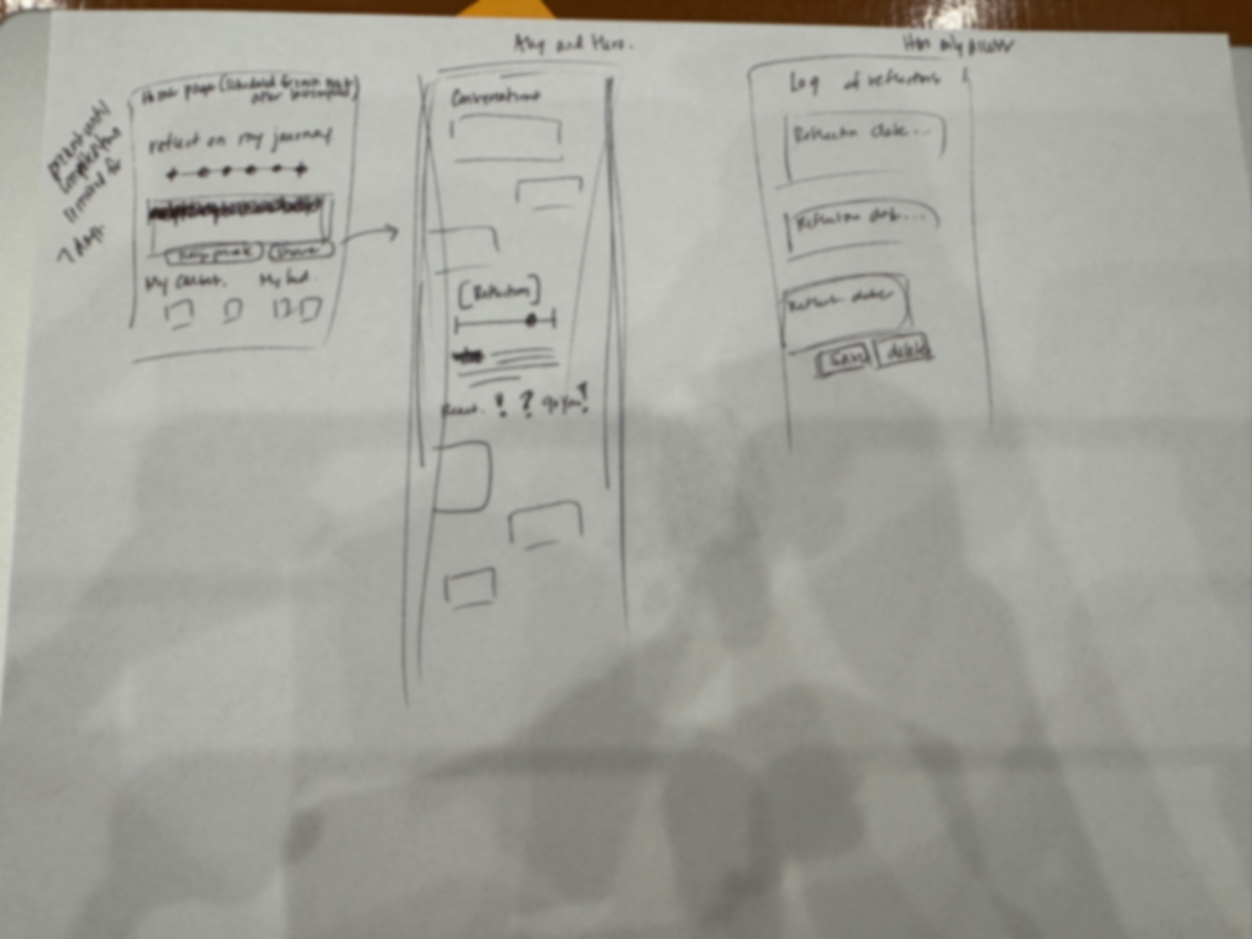
3. Conceptual modeling in real time
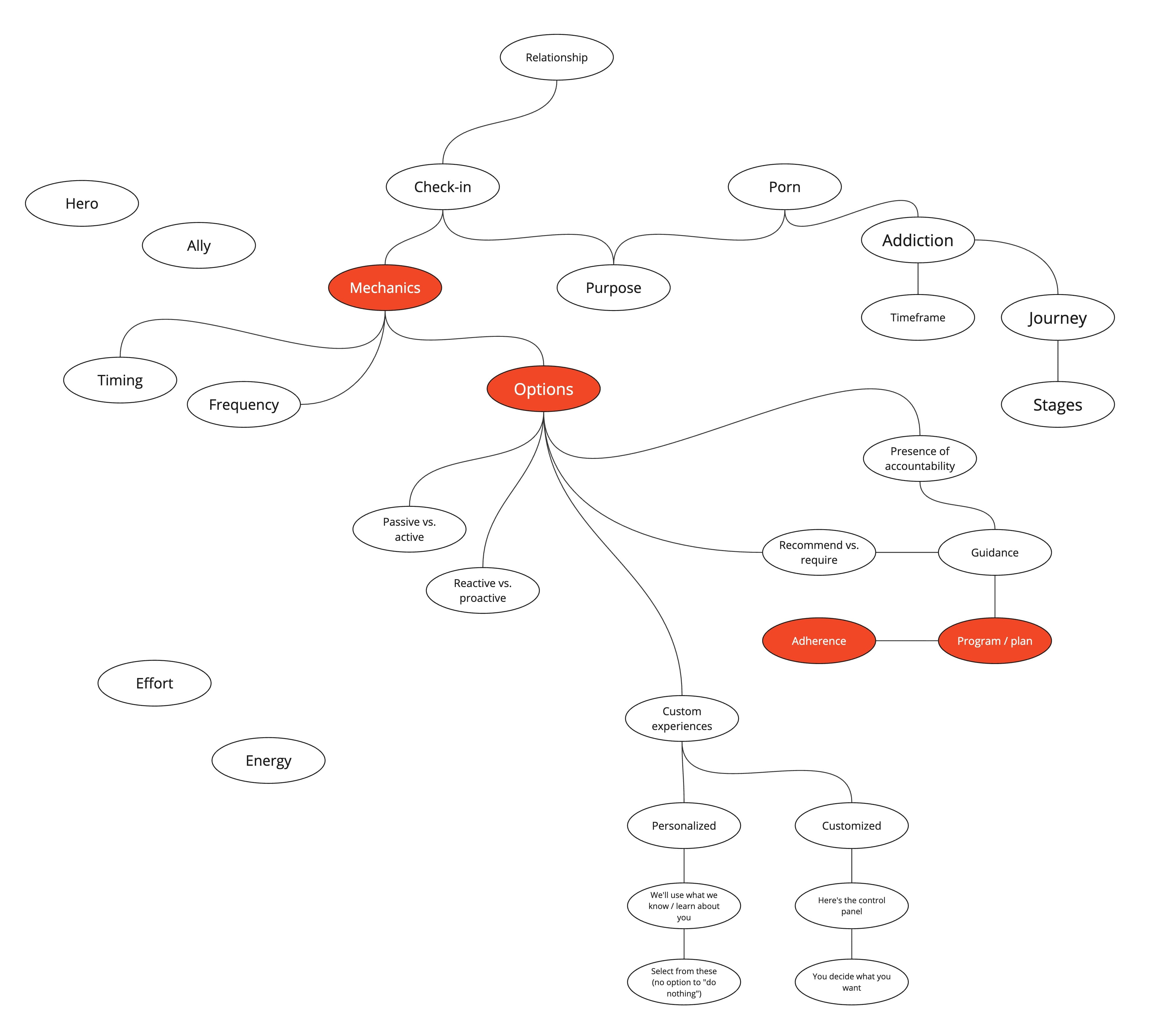
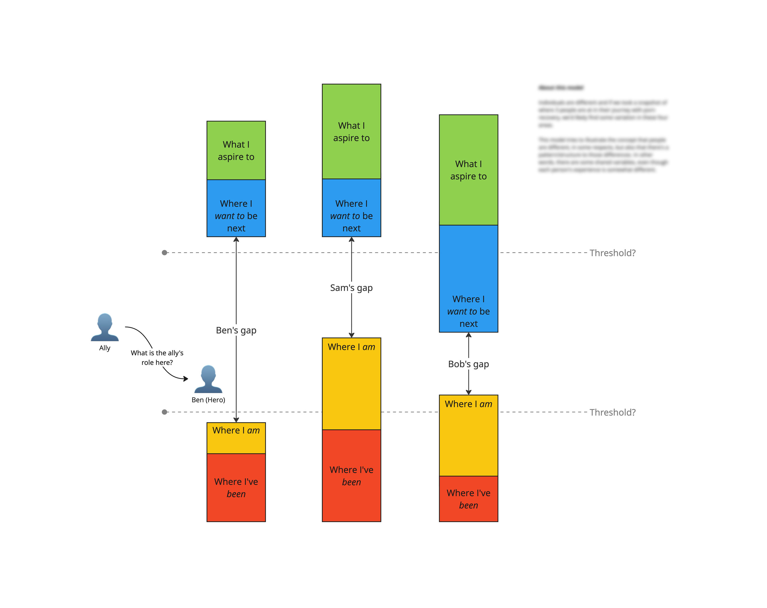
During the first day of the onsite, I took detailed notes and created simple visual models in real time, in order to make abstract disagreements tangible and keep the discussion anchored in the right level of detail.
This allowed stakeholders to disagree productively without defaulting to screens.
People need different things, but there's a structure to those differences.
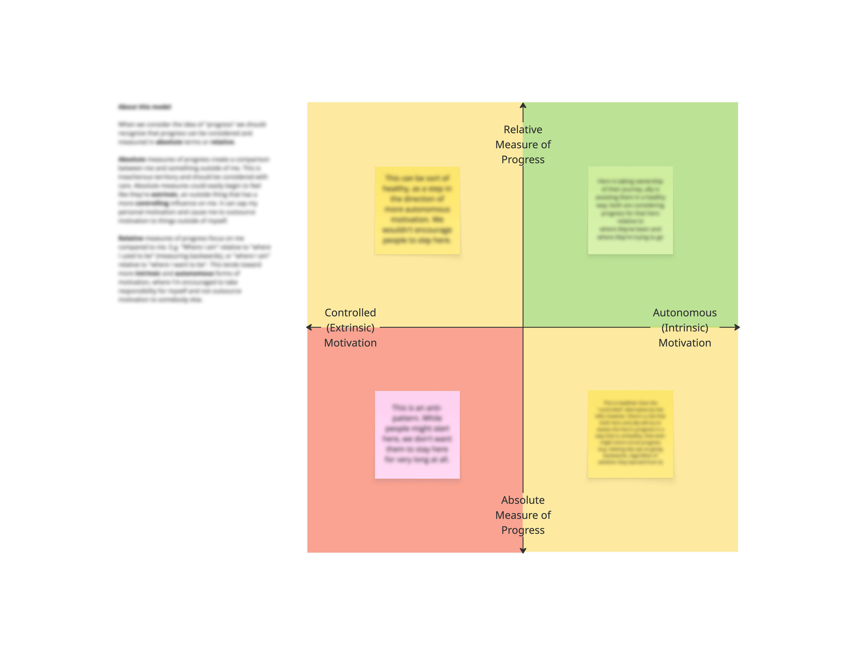
People want progress, but it matters how we help them measure it
Key Decisions
Align on concepts before screens
We deliberately paused screen-level exploration to resolve foundational questions about what a check-in is, how it relates to reporting, and why it should exist in the system at all.
This moved beyond the organization’s default expectations for UX — and initially outside Tim’s comfort zone — but it prevented downstream decision churn and rework.
Surface individual perspectives before group dynamics flattened them
Productive disagreement is inevitable in the early stages of a project. The risk is letting it surface too late, in the wrong form.
I met with each stakeholder to prevent that from happening.
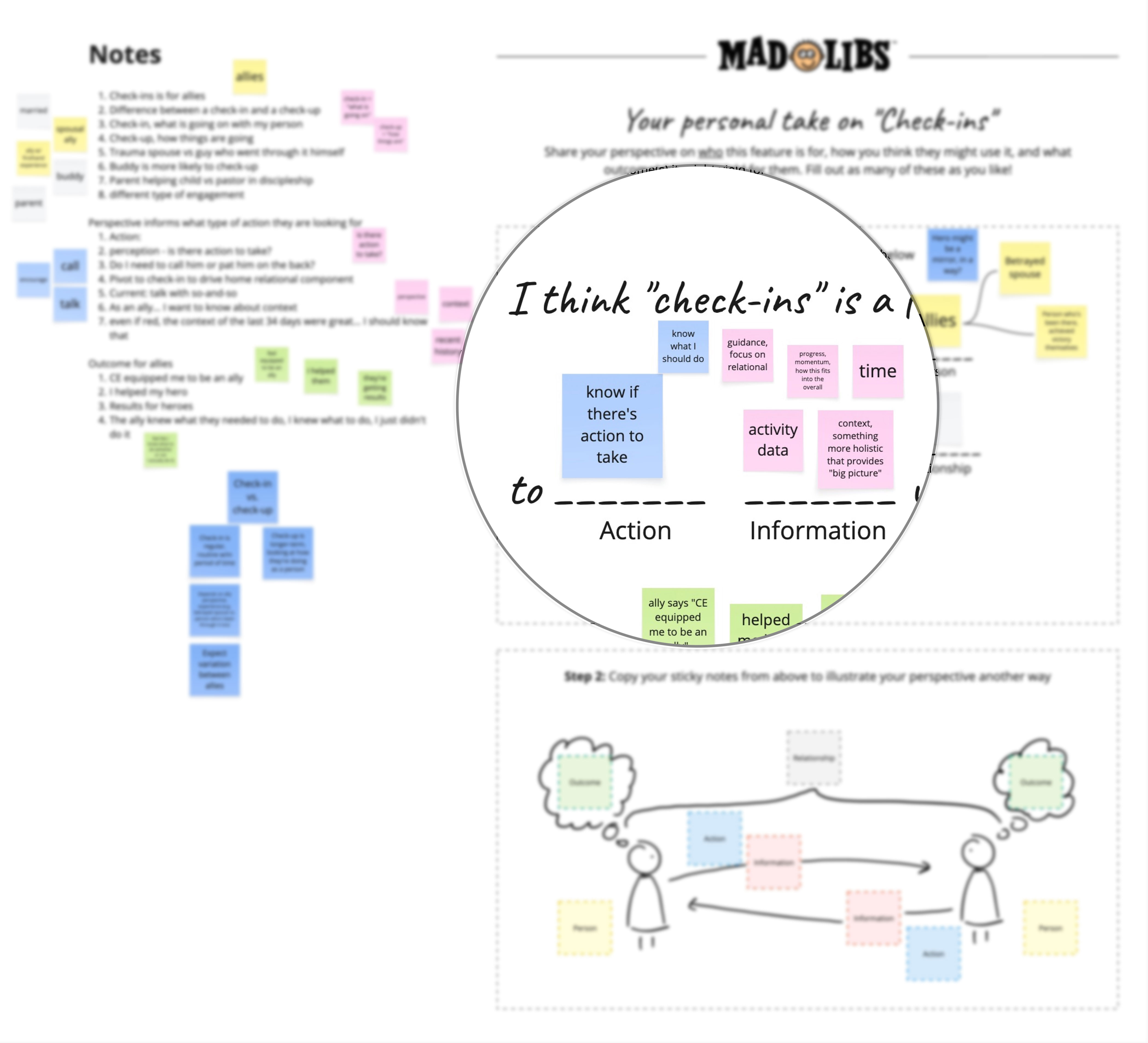
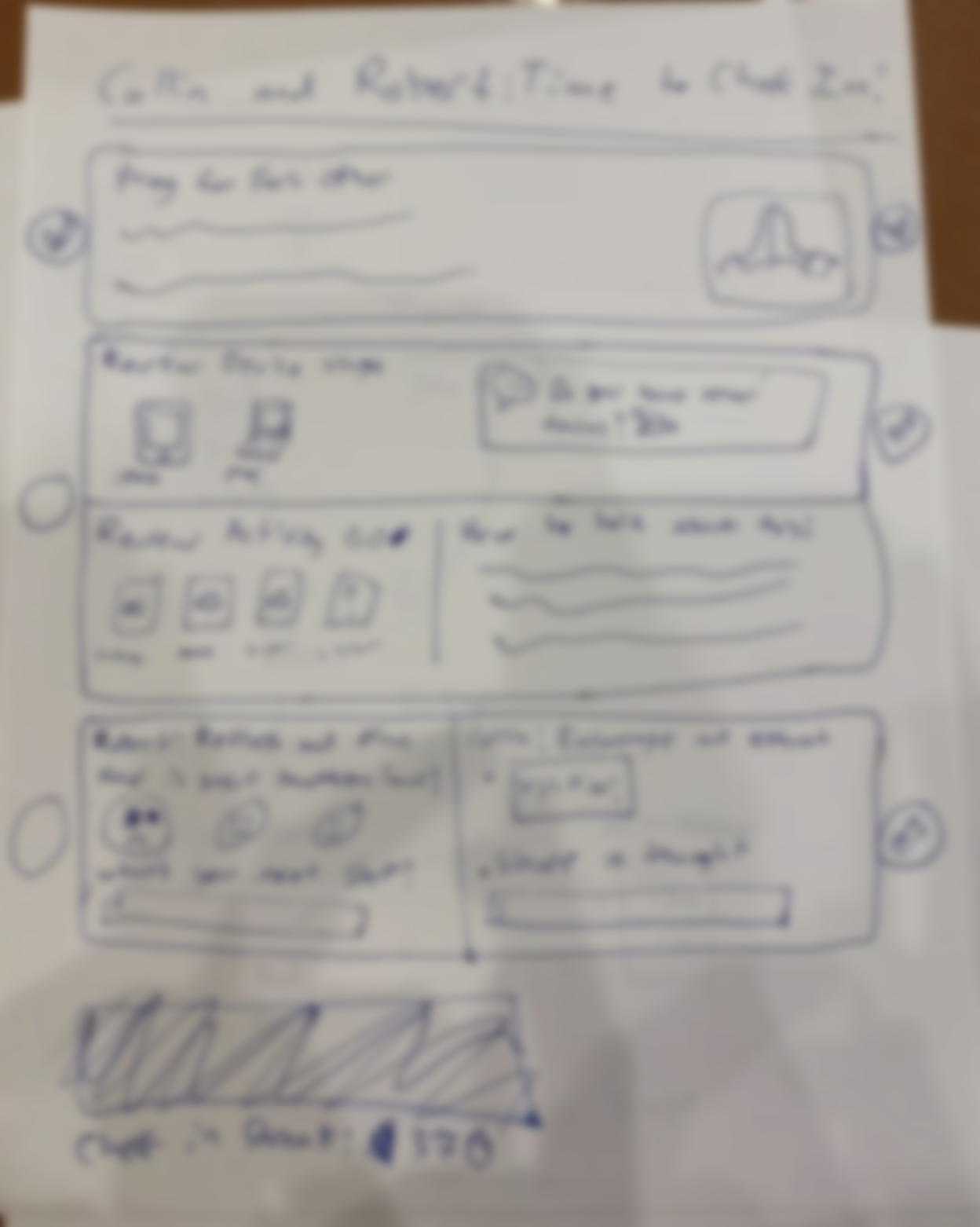
I used a 'mad libs' format to gather peoples' answers to simple - but critical - questions
Here were my discoveries:
- Stakeholders had a lot of thoughts about how check-ins could benefit customers, so I encouraged Aaron (our researcher) to bring a strong “customer outcomes” angle, based in research, to keep these aspirations grounded.
- Few had a clear idea of what information a check-in should contain. They described its characteristics but not what the information would actually be. I recommended Tim get into this on day 2.
- We have two basic types of users: heroes and allies. Stakeholders were not aligned on who we were designing for. I suggested that Tim could raise this topic and help the group find common ground.
- Some stakeholders (including the VP of Product) had strong opinions about the structure and mechanics of check-ins, while others barely mentioned it. We would need to understand the deeper “why” behind their ideas.
Together, these insights shaped both the workshop agenda and the order in which decisions needed to be made.
Facilitate in person
Being in the room allowed for disagreement to emerge and be channeled in a productive direction. Tim’s in-person facilitation was critical to maintaining momentum once difficult topics surfaced.
As a virtual attendee, I could show my work on the monitor or the projector
Participants were also able to do hands-on activities like sketching. This leveled the playing field and helped each person play a more active role in decisions.
Outcome
Explicit agreement
The team moved from assumed alignment to explicit agreement on the fundamentals, including:
- Check-ins as a container for reporting
- Relationship-building as a primary goal (vs. something we presume will happen)
- Clear boundaries around information sharing, with an emphasis on user privacy and agency
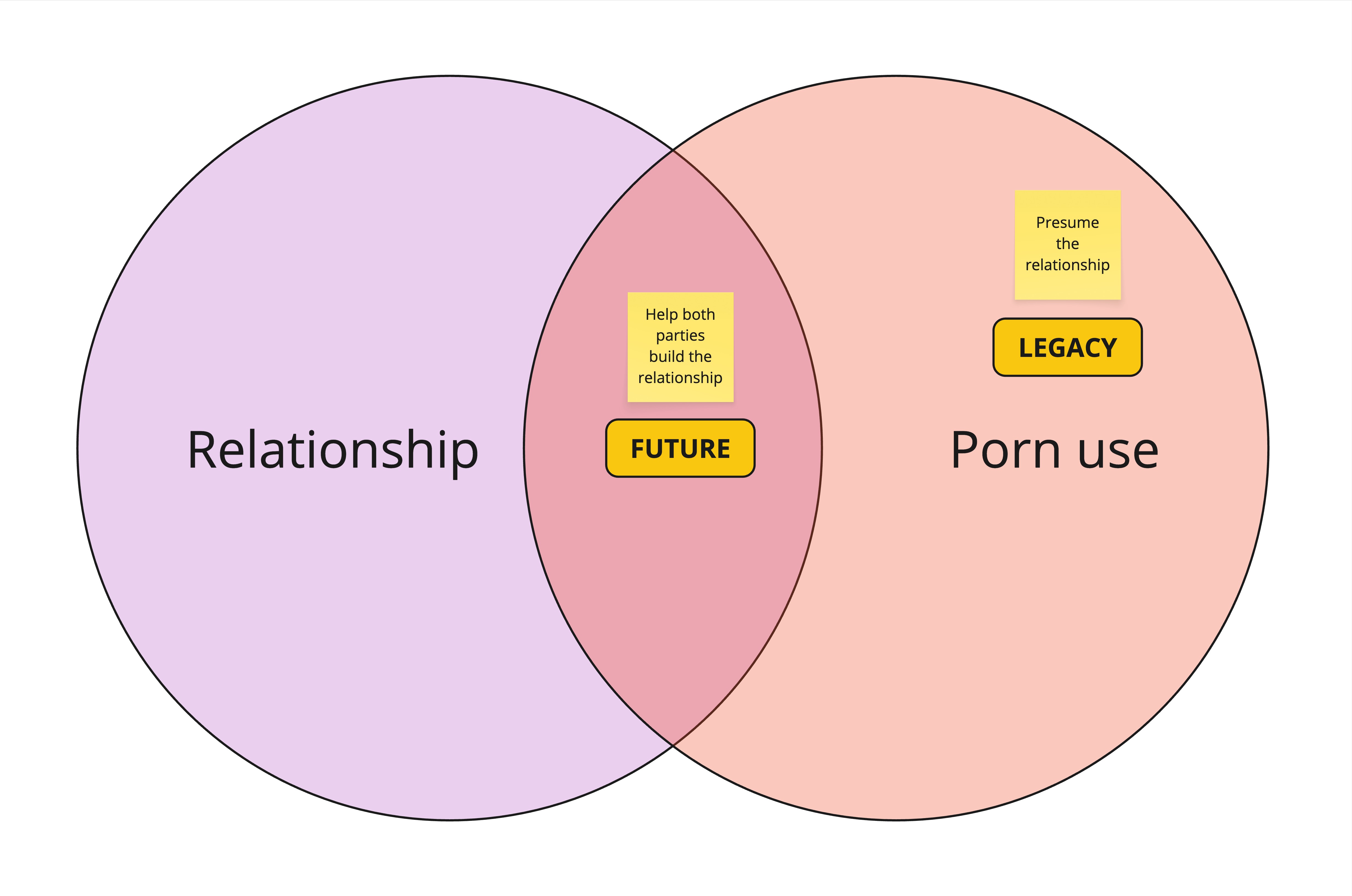
The balance between behavior and relationship is at the heart of our service, and we agreed to shift that balance toward the relationship
Working definition
We arrived at a working definition of “check-in” which became a stable reference point for design, product, and leadership decisions.
Check-in (noun)
An opportunity for a hero to reflect on:
- What they want for themselves
- What they’ve committed to do
- The progress they’ve made (or not)
- What they can learn from their experience
…In the presence of another whose intent is to help the hero achieve what they’ve committed to, where:
- The ally’s agenda is secondary and contingent on the hero’s
- Their engagement contributes to greater motivational autonomy for the hero
- They engage in a way that’s healthy and optimized for the long-term relationship
Successful launch
This foundation materially improved our ability to move forward, enabling:
- Faster, more confident downstream design
- Streamlined (not perfect!) decision-making
- Stronger buy-in across Product, UX, Marketing, and executive leadership
The feature launched in January 2025. While challenges remained (as they always do) we avoided larger failures by addressing the right problems at the right level.
Reflection
Most “design disagreement” is not about UI.
It’s usually about peoples’ unexamined differences in one of these areas:
- System model: we disagree on how the system should work and why
- Mental model: we disagree about who we’re designing for and what they want, need, and expect
- Conceptual model: we disagree about how to reconcile #1 and #2
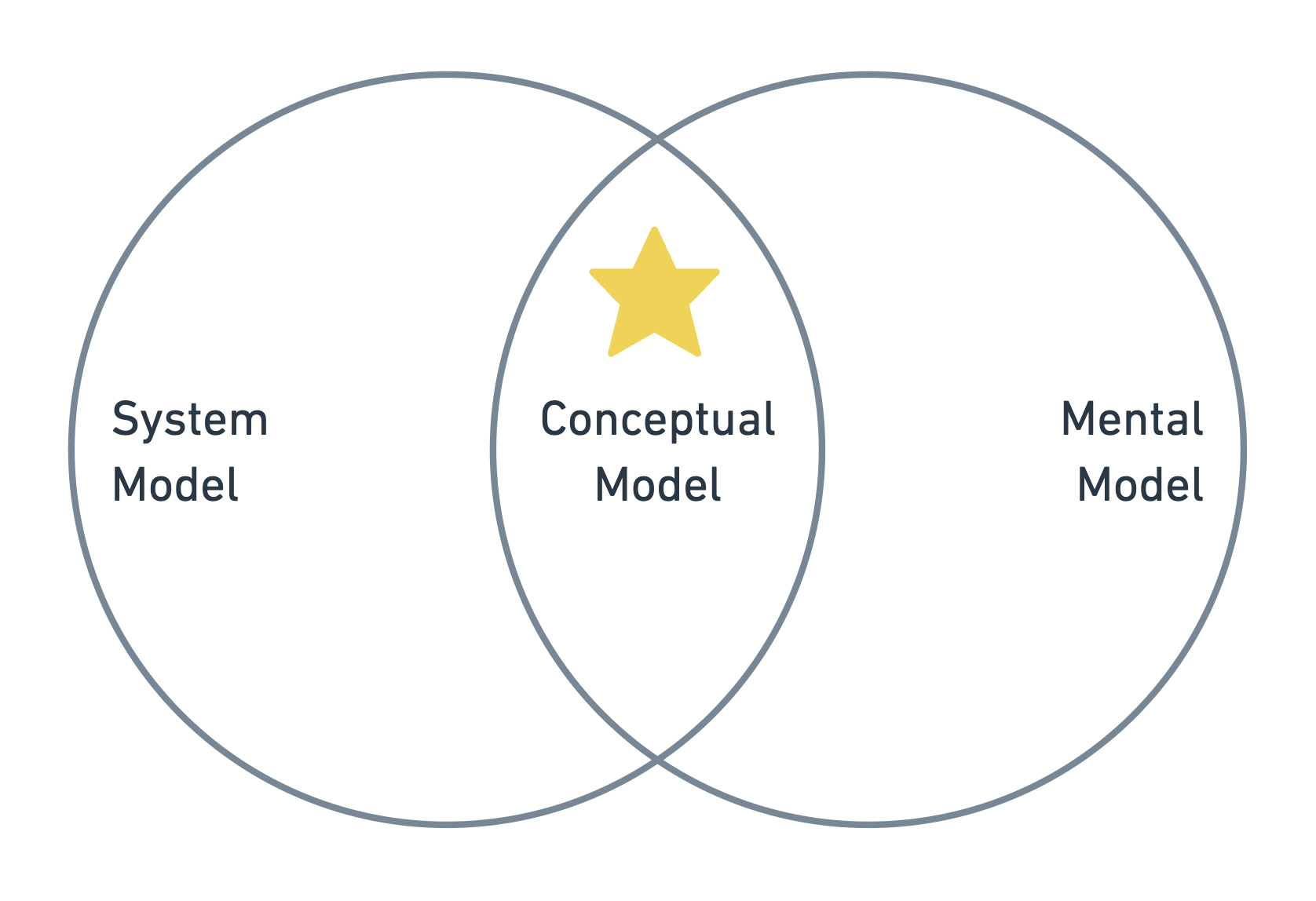
UI will amplify those differences, however, it’s not the root cause.
My role is to identify where disagreement actually lives and help teams resolve it consciously before it becomes product debt.